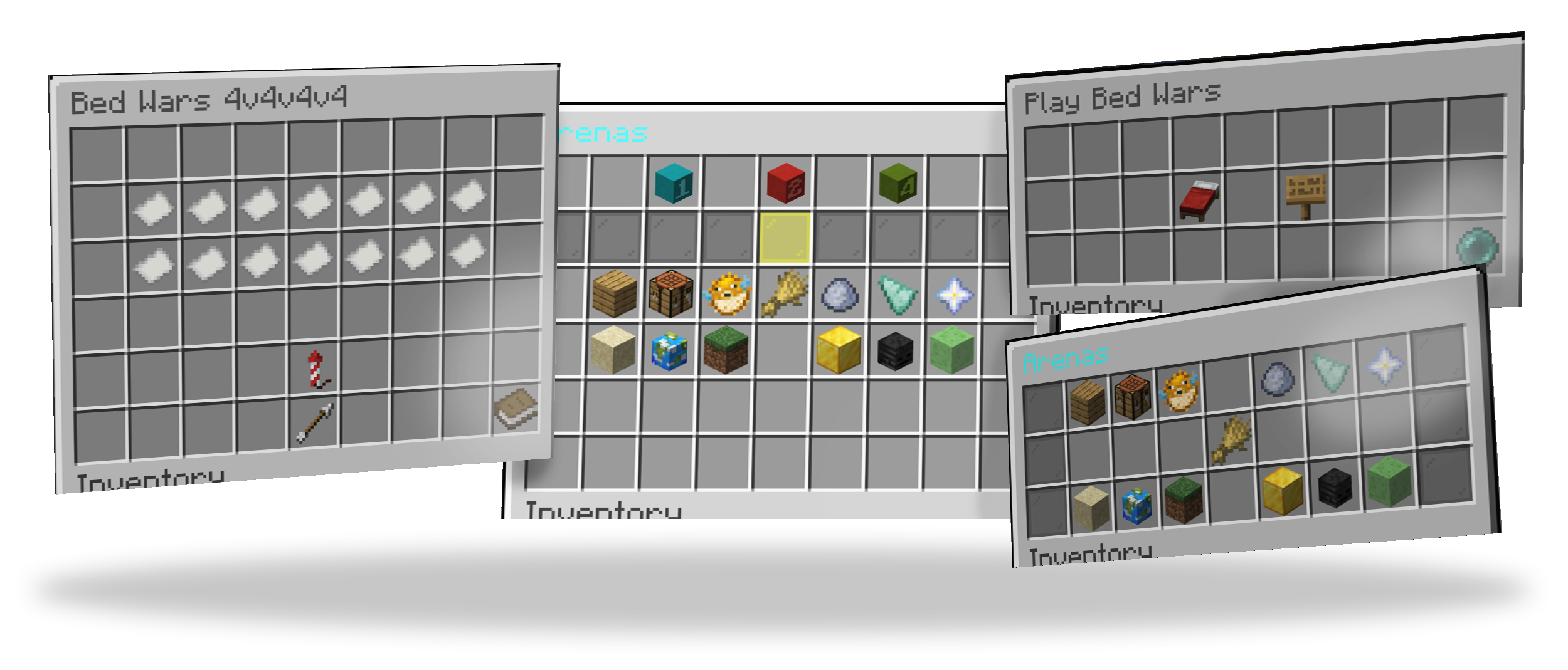
It seems unbelievable, but MBedwars has a full blown system to create custom GUIs. This basically means that you don't actually need an additional third-party plugin to create GUIs. Due to the name "ArenasGUI" you may think that the main purpose of it is to only display GUIs whose main purpose is for you to click on an arena. But in fact due to the modularity of the system, you may create a GUI of any kind.
A layout is basically a single page that can be opened using the /bw arenasgui open <layout> [player] [picker condition] command. Note that it is not possible for a normal player to execute this command, as this permission requires the mbedwars.admin permission. But this is not a problem, as you may easily insert the player name as a parameter into the command using the plugin that you use to open the command in the first place. E.g. with the plugin Citizens you'd do the following: /npc command add mbedwars arenasgui open default_basic <p>. Replace default_basic with the name of the layout that you actually want to use.
In case you want to create your own layouts or modify the default layouts, you may find all existing ones within the /MBedwars/arenasgui-layouts folders. Each file must follow the following structure:
¶ Making players open the GUI
There is no permission to open the GUI. This is to enforce good practice, as such commands shall not be accessed by players and instead shall be redirected to by third-party plugins (e.g. NPCs or GUIs). These plugins then execute that command via console (granting all players) and include their player name placeholder within the player name argument of the command.
¶ Example: Citizens (Command)
Run /npc select while looking at a spawned NPC to select it. Then run this exact command to make the NPC open the shop when clicked upon: /npc command add mbedwars arenasgui open default_basic <p>. Replace default_basic with the name of the layout that you want to use.
¶ Example: Citizens (Config)
It might look like this within it's saves.yml file:
Click to see
last-created-npc-id: 0
npc:
  '0':
    metadata:
      cached-skin-uuid: d8d5a923-7b20-43d8-883b-1150148d6955
      cached-skin-uuid-name: test
    name: test
    uuid: c8f4c282-e084-45ff-ac28-09816618af68
    traits:
      location:
        bodyYaw: 131.99768
        world: bla
        x: 125.473
        y: 114.0
        z: 353.2611
        yaw: 131.9977
        pitch: 1.8
      commandtrait:
        commands:
          '0':
            command: mbedwars arenasgui open default_basic <p> ## !! Important part. Replace default_basic with the name of the layout that you want to use
            hand: RIGHT
            player: false ## !! Important
            npc: false ## !! Important
            op: false ## !! Important
            cooldown: 0
            globalcooldown: 0
            n: -1
            delay: 0
            cost: -1.0
            experienceCost: -1
        cost: -1.0
        executionMode: LINEAR
        experienceCost: -1
        hideErrorMessages: false
        persistSequence: false
        temporaryPermissionsDuration: 0
      type: PLAYER
      owner:
        uuid: 8ef8a4a0-3b8b-35a4-bd22-03b77611655d
      spawned: true
      skintrait:
        fetchDefaultSkin: true
        signature: Py4vaAkl/kT1KV6vKWKHXU9XOAcQi7neJ9YbICqzusv2kfKpfELVvcxoME/+YLSUjApJYSx5qb/gTcR1dzy+DAOU8P4KDfqM9WkXzP3ndujnHOrLqiTB0NIJCX/dzkx6hyZZFlmE/L/kqREsvPydlZhDqAKjhxPpl8n2sUPDv0zU8ztxEYR8ebbWC+HLmhgmxJlzZga2WnSG77HwRzn1YOCeCCK1NWOXGx4ezH4OtCYZJeqEaY0XHd/B/wTHI9JCyYqgnt0gVc3XoUuFrREhii+D21bDOk9A+tePzkWuSwVLLFbh+O9+3KbFcTF87N8lMkP6Pni1RoAAcf5UKWWjsxae9L42qltHuDZIS/gubJxUSqBrOTbupfT2miuK7Lak7g+HH5GbBY3WrAZPa64XnXpNzqa8bf3Dg/dqo5KXWswoPf5AAHSwJ7hN0YwyCnwSxNwYts6hiPwS+ZVS9yvPOtx+s33U+fo7RMn9+PNV3261LtNRxPLIBbeWX9DMsw1iTK+7bRgS3nJsnmySu5pRJKvaHWtRKv1K2eJS3lTxu1qIUc8SdyqcQzmzwS3n4Icu/rDhZDA98r38cmNJY/lgMuERI4nkon0lK2stagT7/oTgbqwXasw9y1hc9DW3REd7iWL09qgny2dy//3xeUNrQ2jPdw+ufUwroOTBai4KIpM=
        textureRaw: ewogICJ0aW1lc3RhbXAiIDogMTczMDgwNTI2NjE0NCwKICAicHJvZmlsZUlkIiA6ICJkOGQ1YTkyMzdiMjA0M2Q4ODgzYjExNTAxNDhkNjk1NSIsCiAgInByb2ZpbGVOYW1lIiA6ICJUZXN0IiwKICAic2lnbmF0dXJlUmVxdWlyZWQiIDogdHJ1ZSwKICAidGV4dHVyZXMiIDogewogICAgIlNLSU4iIDogewogICAgICAidXJsIiA6ICJodHRwOi8vdGV4dHVyZXMubWluZWNyYWZ0Lm5ldC90ZXh0dXJlLzk2MzQzODk1M2E3ODJkYTc2OTQ4MGIwYTQ5MTI1YTkyZTI1OTIwNzcwMGNiOGUzZTFhYWMzOGU0NzFlMjAzMDgiCiAgICB9CiAgfQp9
        updateSkins: false
    traitnames: inventory,location,commandtrait,type,owner,spawned,scoreboardtrait,skintrait
    navigator:
      speedmodifier: 1.0
      avoidwater: false
      usedefaultstuckaction: false
¶ Example: ZNPCs
Run /znpcs action <id> add CONSOLE mbedwars arenasgui open default_basic %player_name%. Replace <id> with the id of your NPC. Replace default_basic with the name of the layout that you want to use.
Note, if that doesn't work: ZNPCs depends on PlaceholderAPI and its Player extension.
¶ Example: DeluxeMenus
You may configure an item similar to this:
Click to see
items:
  '0':
    material: GRANITE
    slot: 0
    display_name: '&fTest'
    left_click_commands:
    - '[console] mbedwars arenasgui open default_basic %player_name%' # Replace default_basic with the name of the layout that you want to use.
    right_click_commands:
    - '[console] mbedwars arenasgui open default_basic %player_name%' # Replace default_basic with the name of the layout that you want to use.
¶ Example: MBedwars (ArenasGUI)
One layout file may look like this:
Click to see
header:
  name: "example"
  version: "1.0"
  author: "MBedwars Team"
  min-version: "1.13"
  height: 3
  title: "%ArenasGUI_Title%"

elements:
  - type: executecommand-button
    x: 0
    y: 0
    item: 'STONE'
    command: 'mbedwars arenasgui open default_basic {player}' # Replace default_basic with the name of the layout that you want to use.
    as-console: true
¶ Header
The header part briefly contains the generic informations of a layout. This includes its name, the author, the version and the height of the GUI.
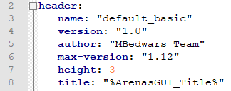
Overall there are the following properties you can give a layout:
¶ name
The property that has to be unique from all others and that's being used for the /bw arenasgui commands. Keep in mind that loading multiple layouts with the same name will result in an error. Meaning that you should try to keep it unique while only containing the following characters: a-Z, 0-9, @, _, - and :. The file name has no effect at all on the final name and will be ignored completely by our system.
¶ version
Makes it easier for distributors and their users to identify whether or not they're using a specific version and by that makes it further easy to update those layouts. The version will be displayed in /bw arenasgui list.
¶ author
A string containing all the names of the people who spend their time in contributing to the specific layout. Will be displayed in /bw arenasgui list as well.
¶ min-version
Limit the minimum Minecraft/Bukkit version that's required to have the specific layout loaded. Users running an older (equal one still works!) will receive a warning during the start of a plugin and won't see the layout ingame. This can be useful when you're working with e.g. NBT tags within the items which don't work on specific versions. You may keep it in the following format: 1.8, 1.9, ... 1.16, 1.17 and etc. It's not possible to use subversions, such as 1.15.2.
¶ max-version
Limit the maximum Minecraft/Bukkit version that can be used to have the specific layout loaded. Users running a greater (equal one still works!) will receive a warning during the start of a plugin and won't see the layout ingame. This can be useful when you're working with e.g. NBT tags within the items which don't work on specific versions. You may keep it in the following format: 1.8, 1.9, ... 1.16, 1.17 and etc. It's not possible to use subversions, such as 1.15.2.
¶ title
Will display the given string as the title of the GUI.

¶ height
The height of the GUI. May range between 1 - 6.
It also supports mathematical operations in JavaScript format. Together with the {arenas} (amount of arenas) placeholder you may vary the height depending on the amount of available arenas. E.g.:
header:
  height: "Math.min(2+Math.ceil({arenas} / 9), 4)"
would vary the height between 2 and 6, depending on the amount of arenas that shall be shown. However, simply defining a constant height is likely already enough for most:
header:
  height: 3
¶ arena-condition
Limit the arenas that shall be shown within the GUI. Useful when you e.g. want to have separate GUIs for different arena modes (mode = solo, duo etc.). Value must be in the format of an arena picker. Example:
header:
  arena-condition: "[players_per_team=2]"
With this set, only duo arenas (arenas with 2 players per team) will be shown in the GUI. It is possible to limit further arenas using the condition config available for arenas-collection elements (explained further below) and using the picker condition parser within the open command.
¶ Elements
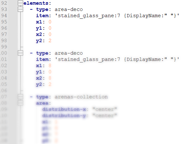
Using elements you are actually able to add things to the GUI. Imagine your GUI as a canvas with each element, going from top to bottom, painting something on it.
Each element will accept coordinates so that you are precisely able to define where exactly it shall be painted on the GUI. The following image may help you with finding the slot:
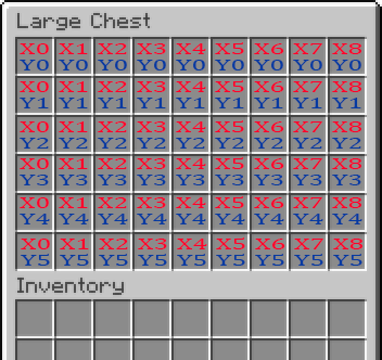
The elements config accepts an endless amount of entries. Each entry must include a type config with which you are able to define how exactly the element shall behave. You may choose either of the following:
¶ fill-deco
Fills every block within the GUI. It likely only makes sense to use this as the first element, as anything drawn prior will be overwritten by this one. Useful for preparing a background.
Example:
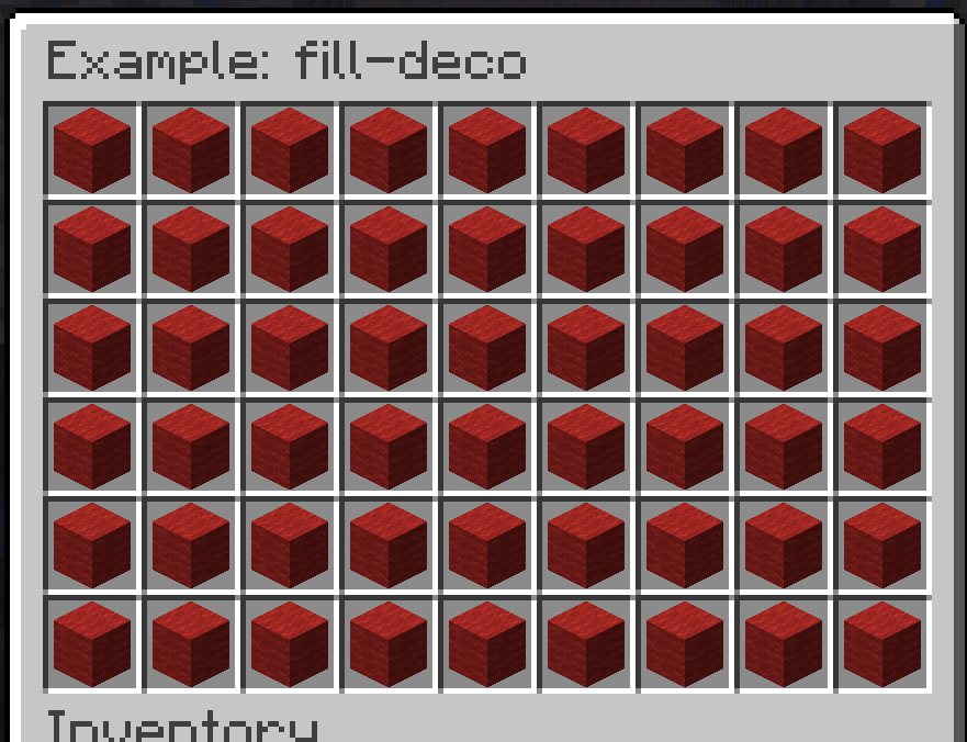
elements:
  - type: fill-deco
    item: "red_wool"
Available configs:
| Name | Type | Meaning |
|---|---|---|
| item | Item | The material that shall be shown as the icon in the GUI. It uses this syntax. Supports PlaceholderAPI placeholders |
¶ single-deco
Adds a single item to the GUI.
Example:
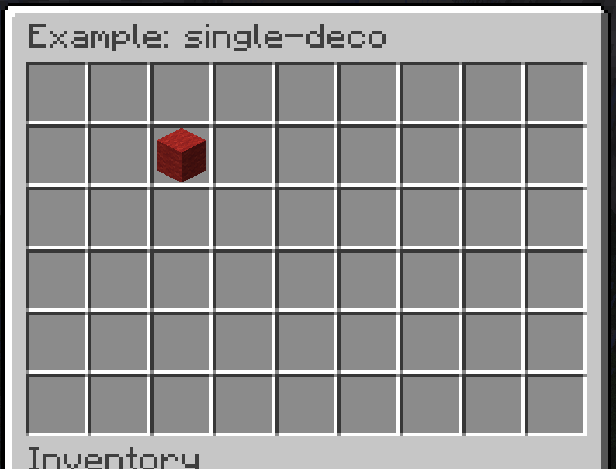
elements:
  - type: single-deco
    item: "red_wool"
    x: 2
    y: 1
Available configs:
| Name | Type | Meaning |
|---|---|---|
| item | Item | The material that shall be shown as the icon in the GUI. It uses this syntax. Supports PlaceholderAPI placeholders |
| x | A number between 0 and 8 | The position on the x-axis of the GUI-grid |
| y | A number between -5 and 5 | The position on the y-axis of the GUI-grid. A negative number results it to be added to the bottom of the GUI relatively to its height. E.g. -1 would be the last row in the GUI |
¶ border-deco
Adds a border to the GUI. You may also specify whether this shall only be applied for certain sides.
Example:
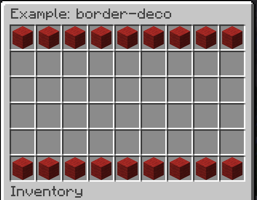
elements:
  - type: border-deco
    item: "red_wool"
    top: true
    bottom: true
    right: false
    left: false
Available configs:
| Name | Type | Meaning |
|---|---|---|
| item | Item | The material that shall be shown as the icon in the GUI. It uses this syntax. Supports PlaceholderAPI placeholders |
| top | true / false | Whether a row of items shall be added to the top side |
| bottom | true / false | Whether a row of items shall be added to the bottom side |
| right | true / false | Whether a row of items shall be added to the right side |
| left | true / false | Whether a row of items shall be added to the left side |
¶ area-deco
Fills an item within a certain area within the GUI.
Example:
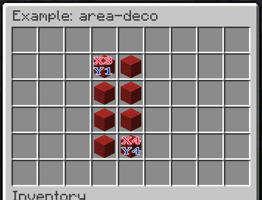
elements:
  - type: area-deco
    item: "red_wool"
    x1: 3
    y1: 1
    x2: 4
    y2: 4
Available configs:
| Name | Type | Meaning |
|---|---|---|
| item | Item | The material that shall be shown as the icon in the GUI. It uses this syntax. Supports PlaceholderAPI placeholders |
| x1 | A number between 0 and 8 | The position for the first corner on the x-axis of the GUI-grid |
| y1 | A number between -5 and 5 | The position for the first corner on the y-axis of the GUI-grid. A negative number results it to be added to the bottom of the GUI relatively to its height. E.g. -1 would be the last row in the GUI |
| x2 | A number between 0 and 8 | The position for the second corner on the x-axis of the GUI-grid |
| y2 | A number between -5 and 5 | The position for the second corner on the y-axis of the GUI-grid. A negative number results it to be added to the bottom of the GUI relatively to its height. E.g. -1 would be the last row in the GUI |
¶ changelayout-button
Adds a single item that changes the ArenasGUI layout when clicked on it.
Example:
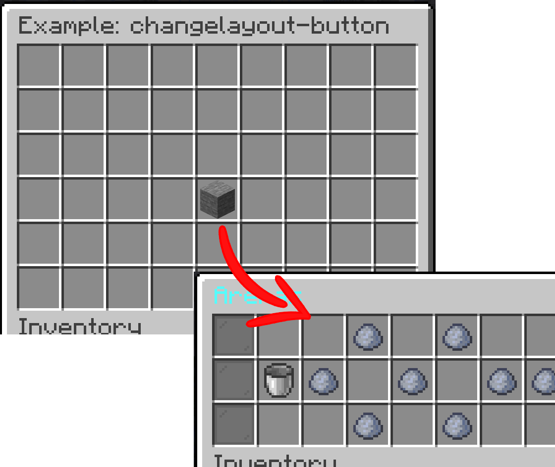
elements:
  - type: changelayout-button
    item: "stone"
    layout: "default_basic" # The name of the new layout
    x: 4
    y: 3
Available configs:
| Name | Type | Meaning |
|---|---|---|
| item | Item | The material that shall be shown as the icon in the GUI. It uses this syntax. Supports PlaceholderAPI placeholders |
| layout | Text | The name of the layout which shall be opened that is configured within header.name of its .yml file |
| click-sound | Sound | The sound that shall be played when clicked on the item. It uses the same format as sounds within sounds.yml |
| x | A number between 0 and 8 | The position on the x-axis of the GUI-grid |
| y | A number between -5 and 5 | The position on the y-axis of the GUI-grid. A negative number results it to be added to the bottom of the GUI relatively to its height. E.g. -1 would be the last row in the GUI |
¶ executecommand-button
Adds a single item that executes a command when clicked on it.
Example:
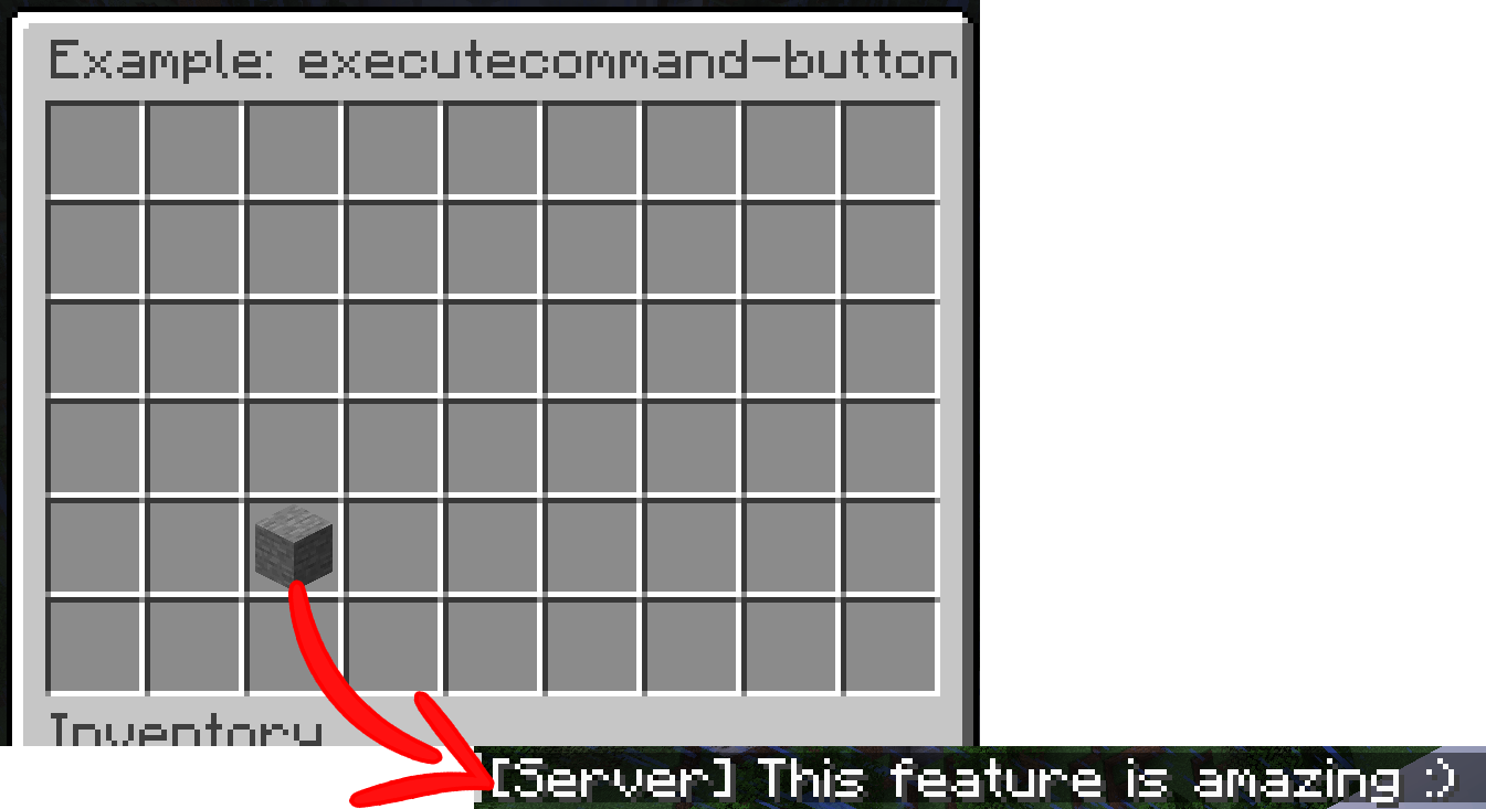
elements:
  - type: executecommand-button
    item: "stone"
    command: "say This feature is amazing :)"
    as-console: true
    close-inventory: true
    x: 2
    y: 4
Available configs:
| Name | Type | Meaning |
|---|---|---|
| item | Item | The material that shall be shown as the icon in the GUI. It uses this syntax. Supports PlaceholderAPI placeholders |
| command | Text | The command that shall be executed. It may not have a leading /. Available placeholders: {player}, {playeruuid} |
| as-console | true / false | Whether it shall be executed as the console (true) or be executed as if the player who clicked on the item typed it within its chat (false). Default value is false |
| close-inventory | true / false | Whether the GUI shall be closed once he clicked on it. Default value is false |
| click-sound | Sound | The sound that shall be played when clicked on the item. It uses the same format as sounds within sounds.yml |
| x | A number between 0 and 8 | The position on the x-axis of the GUI-grid |
| y | A number between -5 and 5 | The position on the y-axis of the GUI-grid. A negative number results it to be added to the bottom of the GUI relatively to its height. E.g. -1 would be the last row in the GUI |
¶ arenas-collection
An area within your GUI that is being filled with arenas. Clicking on an arena results in you trying to join the arena. In case it's enabled in the configs, clicking on a running round results in you spectating the match.
Example:
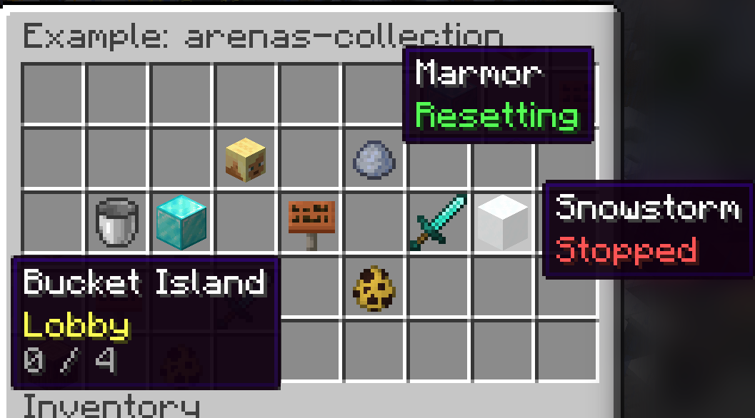
elements:
  - type: arenas-collection
    area:
      distribution-x: "center" # May be LEFT, RIGHT or CENTER
      distribution-y: "center" # May be TOP, BOTTOM or CENTER
      x1: 1
      y1: 0
      x2: 7
      y2: 4
    set-icon-when:
      - condition: "[status=2]" # Lobby
        set-nbt: '{DisplayName:"§f{display-name}", Lore:["§e%Sign_Lobby%", "§7{players} / {max-players}"]}'
      - condition: "[status=3 | status=5]" # Running or Endlobby
        set-nbt: '{DisplayName:"§f{display-name}", Lore:["§6%Sign_Running%", "§7{players} / {max-players}"]}'
      - condition: "[status=4]" # Resetting
        set-nbt: '{DisplayName:"§f{display-name}", Lore:["§b%Sign_Reseting%"]}'
      - condition: "[]" # Everything else
        set-nbt: '{DisplayName:"§f{display-name}", Lore:["§c%Sign_Stopped%"]}'
    prev-page-button:
      item: arrow {DisplayName:"§f%SetupGUI_PrevPage%"}
      x: 0
      y: -1
    next-page-button:
      item: arrow {DisplayName:"§f%SetupGUI_NextPage%"}
      x: 8
      y: -1
Available configs:
| Name | Type | Meaning |
|---|---|---|
| area.distribution-x | LEFT / RIGHT / CENTER | How the arena items shall be distributed within the GUI. E.g. RIGHT would move them to the right within the area. Default value is LEFT |
| area.distribution-y | TOP / BOTTOM / CENTER | How the arena items shall be distributed within the GUI. E.g. BOTTOM would move them to the bottom within the area. Default value is TOP |
| area.x1 | A number between 0 and 8 | The position for the first corner on the x-axis of the GUI-grid |
| area.y1 | A number between -5 and 5 | The position for the first corner on the y-axis of the GUI-grid. A negative number results it to be added to the bottom of the GUI relatively to its height. E.g. -1 would be the last row in the GUI |
| area.x2 | A number between 0 and 8 | The position for the second corner on the x-axis of the GUI-grid |
| area.y2 | A number between -5 and 5 | The position for the second corner on the y-axis of the GUI-grid. A negative number results it to be added to the bottom of the GUI relatively to its height. E.g. -1 would be the last row in the GUI |
| set-icon-when | List of config sections | In here you may optionally define how the GUI shall be modified depending on the state of the arena. Without anything defined in this config, simply the icon of the arena is being displayed together with its name. The plugin goes from top to bottom within this config and checks for the arena picker condition that matches. The condition may be configured using a - set-material: Modify the material of the item. Note that you may only type the material of the name. E.g. STONE:5 wouldn't work.
- set-durability: Modify the value of the durability of the item. E.g. 50 would be a acceptable value. This is also how you i.a. change the color of wool in 1.12 and older versions (e.g. 14 would be red)
- set-amount: Modify the amount that shall be displayed for this item within the GUI.
- set-nbt: Replace the NBT of the icon.
- set-click-sound: Play a certain sound when clicked on the item while the condition is met. See "click-sound" below.You may also use these placeholders for the configs above: {display-name}, {name}, {players}, {max-players}, {teams}, {players-per-team}, {author} |
| group-by-displayname | true / false | Arenas with the same display name get merged into a single button. The best lobby arena gets prioritized. false by default |
| click-sound | Sound | The sound that shall be played when clicked on the item. It uses the same format as sounds within sounds.yml |
| prev-page-button.item | Item | The material that shall be shown as the icon for the "go prev page button" in the GUI. It uses this syntax |
| prev-page-button.x | A number between 0 and 8 | The position for the "go prev page button" on the x-axis of the GUI-grid |
| prev-page-button.y | A number between -5 and 5 | The position for the "go prev page button" on the y-axis of the GUI-grid. A negative number results it to be added to the bottom of the GUI relatively to its height. E.g. -1 would be the last row in the GUI |
| next-page-button.item | Item | The material that shall be shown as the icon for the "go next page button" in the GUI. It uses this syntax |
| next-page-button.x | A number between 0 and 8 | The position for the "go next page button" on the x-axis of the GUI-grid |
| next-page-button.y | A number between -5 and 5 | The position for the "go next page button" on the y-axis of the GUI-grid. A negative number results it to be added to the bottom of the GUI relatively to its height. E.g. -1 would be the last row in the GUI |